Colour Coordination Tips you can use today! Colour Coordination is always key when you want to make a card. Get clashing colours and your recipient will squint and cringe! But get the colours right and the card will look so professional! But you made it!
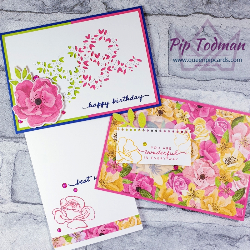
This week’s Livestream video tutorial shows you some great tips on getting the best out of your patterned papers. How to pull out a single colour or two that highlights the images. I love how the duo background image came about by accident!
Colour Coordination Tips Video Tutorial
Tell me your favourite card or what you learned today in the COMMENTS HERE.
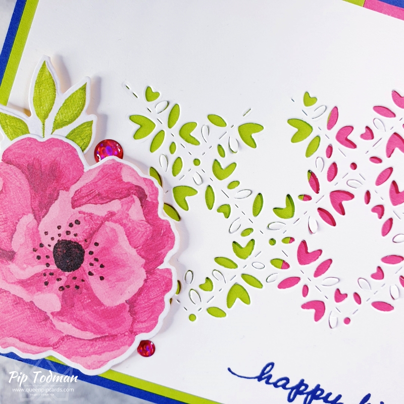
Duo Card Measurements
The standard measurements are easy for this card, even though it packs a punch!
- Colours: Granny Apple Green & Melon Mambo both cut 10 x 7.2 cm, Night of Navy A5 card base folded in half. Basic White top layer 13.9 x 9.5 cm die cut.
- Papers: Hues of Happiness
- Stamps: Happiness Abounds
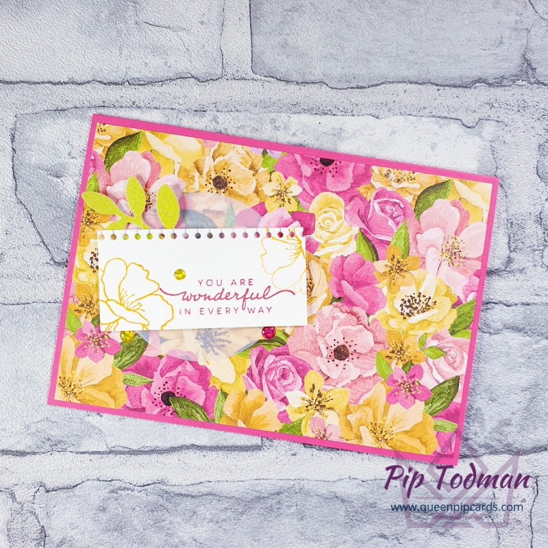
I love how the bright yellows and pinks coordinate beautifully in this next card. Just pull out one or two colours that match card stock you have. If you have a die cutting machine this set is fabulous for you.
Lastly, don’t forget that really simple notecard with some Wink of Stella and a pop from the paper strip inside and out!
Thanks for watching my live stream on replay – don’t forget I’m here each week!
0 Comments